프리즘 / Prism
201901 - 201903
인터랙션디자인, 피지컬 프로토타이핑, 사용성 테스트 / Interaction Design, Physical Prototyping, Usability Testing
UX 디자이너 2명, 프로그래머 1명, 시각 디자이너 1명 / 2 UX Designers, 1 Programmer, 1 Brand Designer
야요이 쿠사마의 거울의 방에서 영감을 받아, 6주간 인터랙티브한 토이를 만드는 프로젝트에 참여했습니다. 이 프로젝트의 목적은 거울의 방을 체험할 때 느낄 수 있었던 감정과 경험들을 인터랙티브한 토이에서 새로운 방법으로 체험할 수 있게 하는 것이었습니다.
이 프로젝트에서 저는 이 토이의 개발을 위한 조사, 프로토타이핑 개발, 그리고 사용성 테스트를 도맡았습니다.
The goal of this six-week project was to design an interactive toy inspired by Yayoi Kusama’s Infinity Mirror Room exhibition. Our group's challenge was to translate the experience of Kusama’s exhibition to an experience of playing with a toy. To approach this unique challenge, we used interaction design methods.
I worked on the entire process with my group with an emphasis on usability testing.

디자인 프로세스 / Design Process
유저 정하기 / Defining user (audience)
이 토이의 프로토타입을 가장 먼저 플레이 해볼 사람들은 다른 인터랙션 디자인 학생들이기에, 그들을 사용자들로 타켓하고 이 토이의 기능과 목적을 조사했습니다.
먼저, 학생들을 '쿠사마의 전시회를 본 사람'과 '전시회를 아직 보지 않은 사람' 두 그룹으로 나누었습니다. 쿠사마의 전시회를 본 사람이라면 그 때의 감성을, 보지 않은 사람이라면 어떤 기대감을 만족시켜야 하는지 예측하기 위함이었습니다.
이 정보는 lo-fi 프로토타이핑 테스트 전 학생들에게 주어지는 설문조사를 통해 수집했습니다.
We wanted the audience of our toy to be the audience of Kusama’s exhibition, but for one person at a time. To understand our potential audience, we researched the Interaction Design program classmates, as they would be the first group of people who’d be playing with our toy. We categorized our classmates into two groups: people who have seen the exhibition and who haven’t seen the exhibition. We collected this information through a survey given before conducting the lo-fi prototype test.
Lo-fi 프로토타이핑 / Lo-fi Prototyping
'우리의 토이는 어떤 즐거움을 어떻게 만족시키는가?'
이 질문에 답하기 위해 lo-fi 프로토타입을 제작해서 사용자들이 토이에 어떻게 접근하고, 만지고, 사용하는지 관찰했습니다.
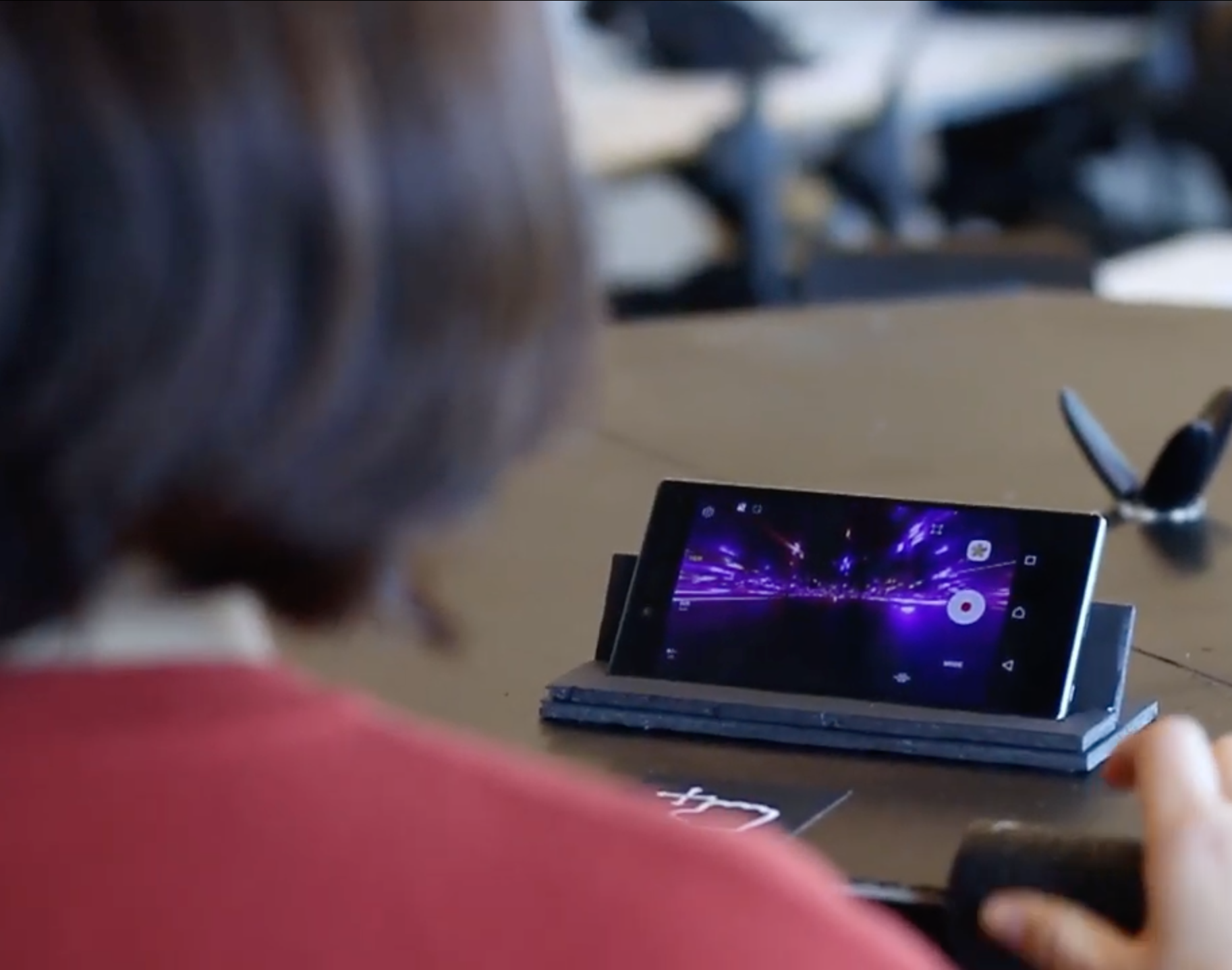
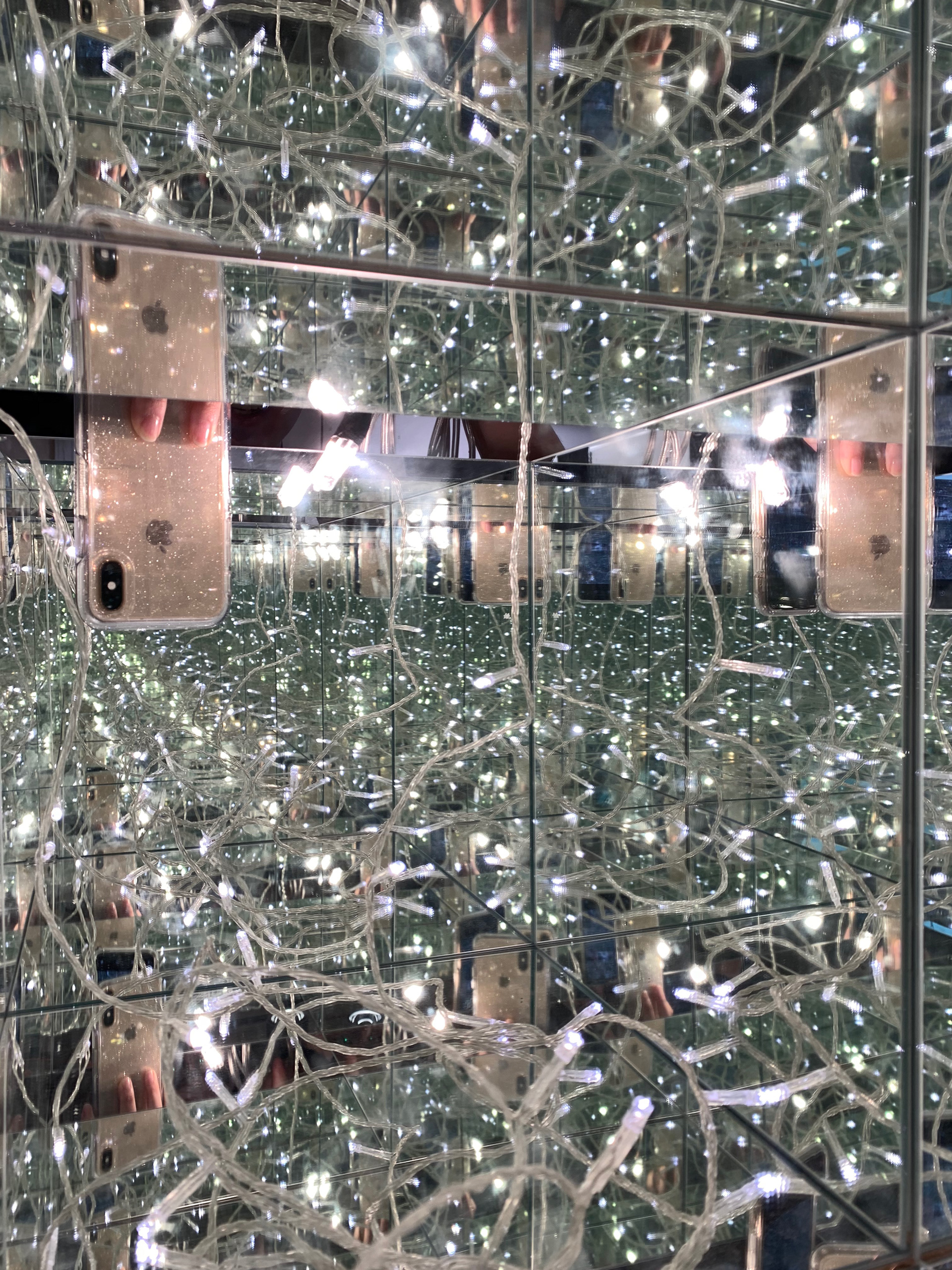
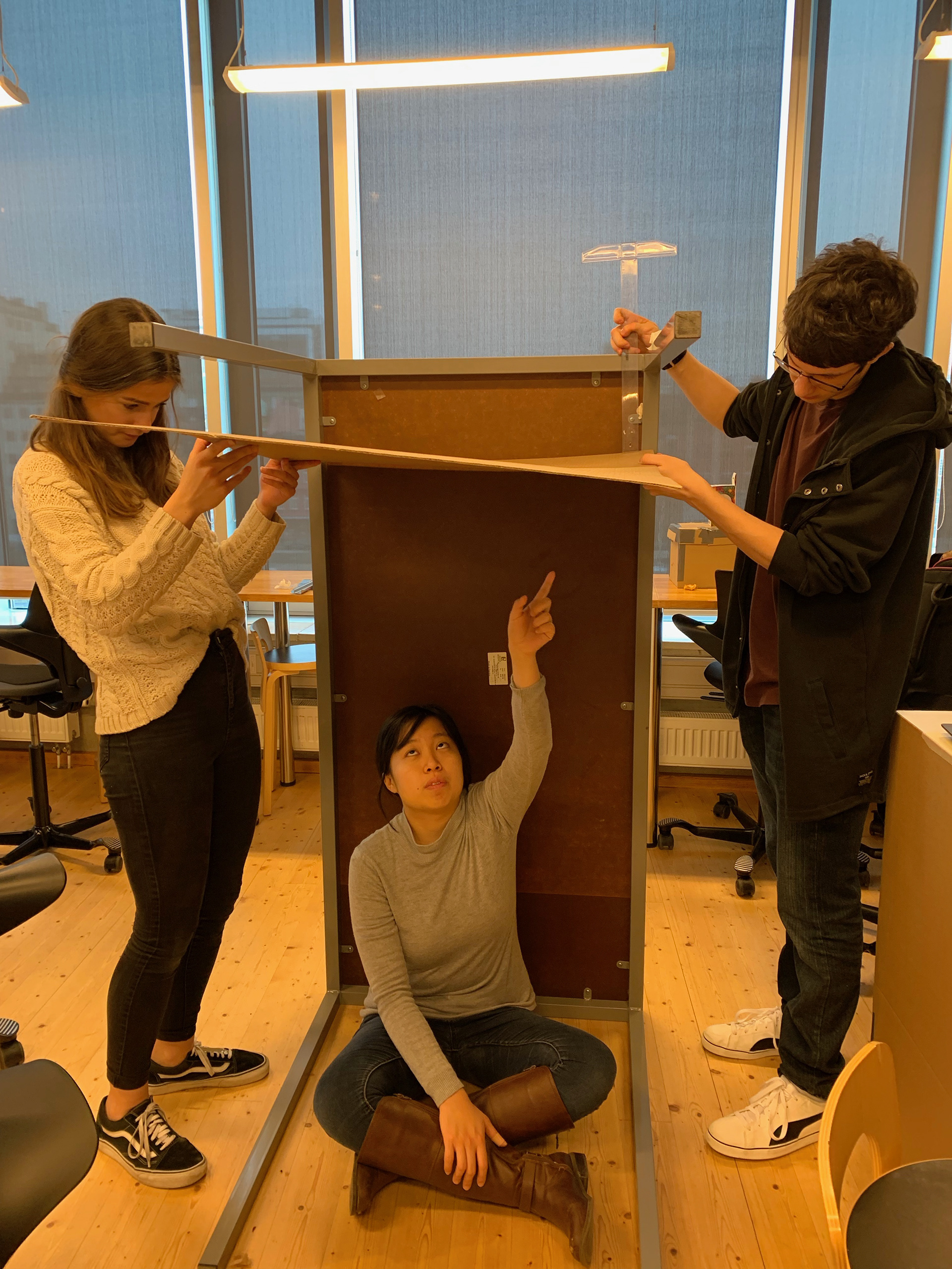
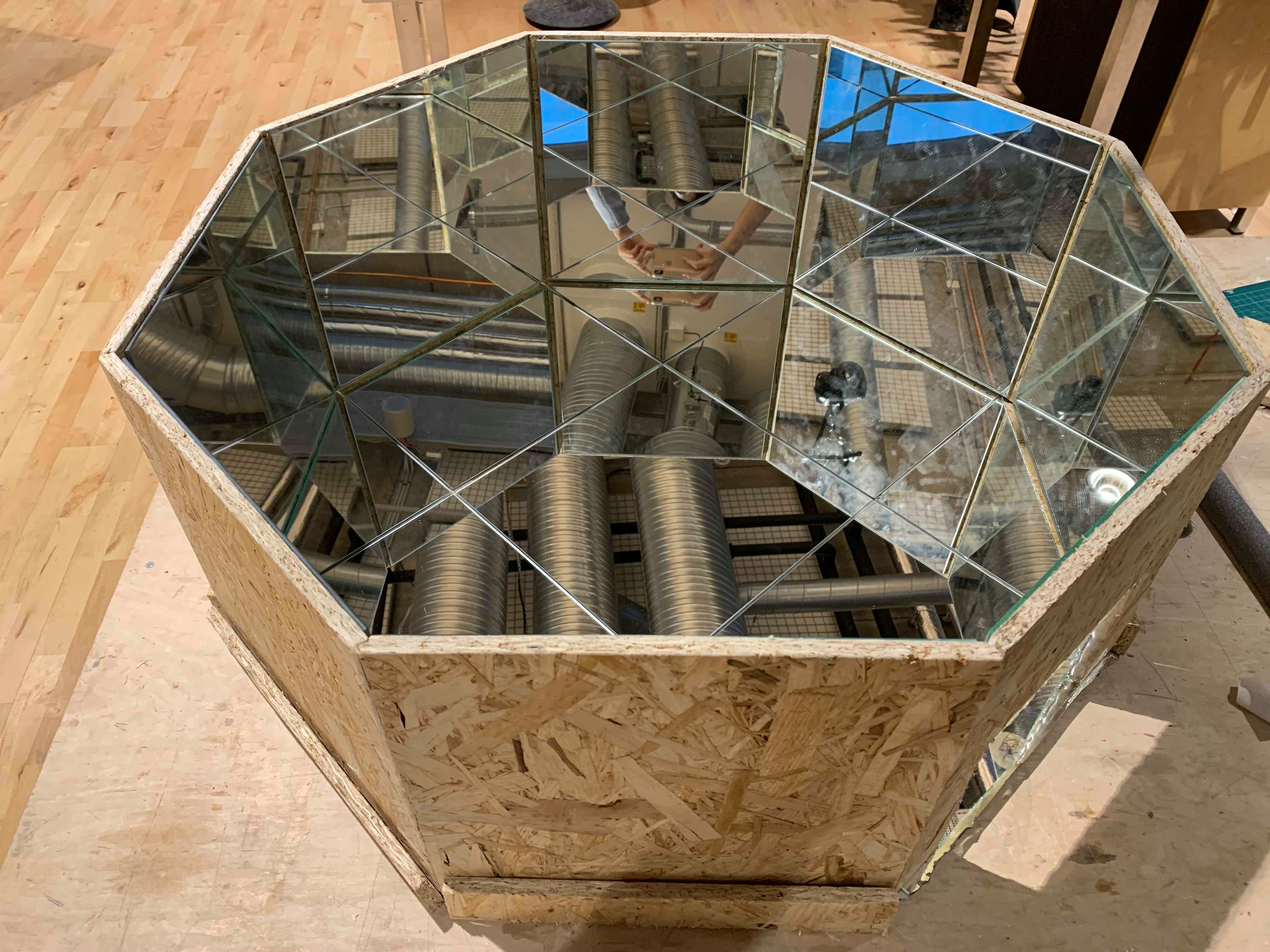
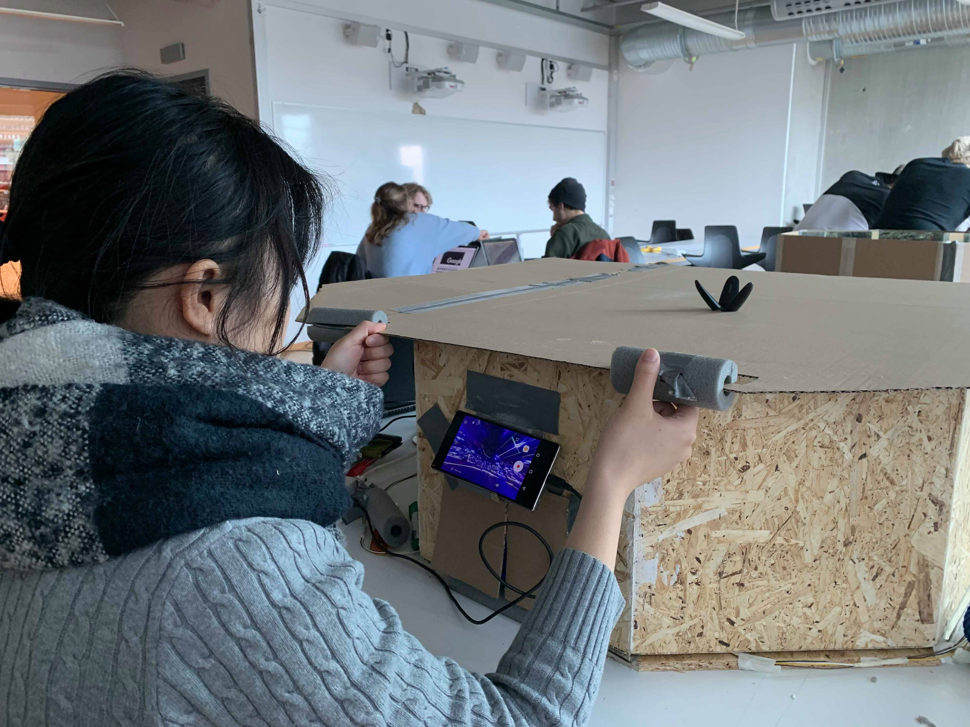
야요이 쿠사마의 방을 재현하기 위해 상자의 모든 면을 거울로 덮고 미니 아두이노 조명과 센서로 채웠습니다. 이렇게 6주간 반사광 재료들과 골판지, 나무를 이용해 3가지의 다른 크기와 모양의 프로토타입을 만들었습니다.
프로토타입들을 만들면서 몇몇의 학생들과 프로토타입을 시험하는 시간을 가졌습니다. 학생들에게 프로토타입을 사용전과 후의 소감을 물어봤고 어떻게 프로토타입을 사용하는지 관찰하고 기록했습니다.
To answer our main question - why is our toy playful to the users - we built a physical prototype and observed how users interacted with it to point out what was playful about it. To do so, we made an infinity box - a box with all surfaces covered with mirrors and filled with Arduino lights and motion detectors - to mimic the infinity image from Kusama’s work.
In a span of 6 weeks, we made three different versions of the prototype of various sizes and shapes using cardboard, wood, and various reflective materials.
Along with building the lo-fi prototypes, we booked students time to interact with our prototypes. We focused on the two points below, and incorporated our findings in iterating the consecutive version.
• Ask how the experience was before and after playing with the prototype
• Observe and record how students interacted with the prototype
사용성 테스트 / Usability Testing
최종 프로토타입을 만들기 전 사용성 테스트를 진행했습니다. 이 테스트
To finalize our prototype, we conducted usability testings with the latest version. During theses testings, we asked a set of questions to gather players’ opinions on what aesthetic, interaction and experience of our toy was playful and satisfying to them.
I prepared the interview questions, conducted the testings, and analyzed the results with my team. For 4 days, we tested 9 usability scenarios with 13 people from our class. Through this testings were we able to define the key interactions of our toy. We used Sicart’s definition of a toy to analyze the interactions people do while playing with a toy.
1. Describe to me what you are doing right now and why.
2. What are you looking at right now?
3. Find an angle and perspective that’s most interesting to you.
4. Was there anything confusing or frustrating?
5. What was the most exciting moment?

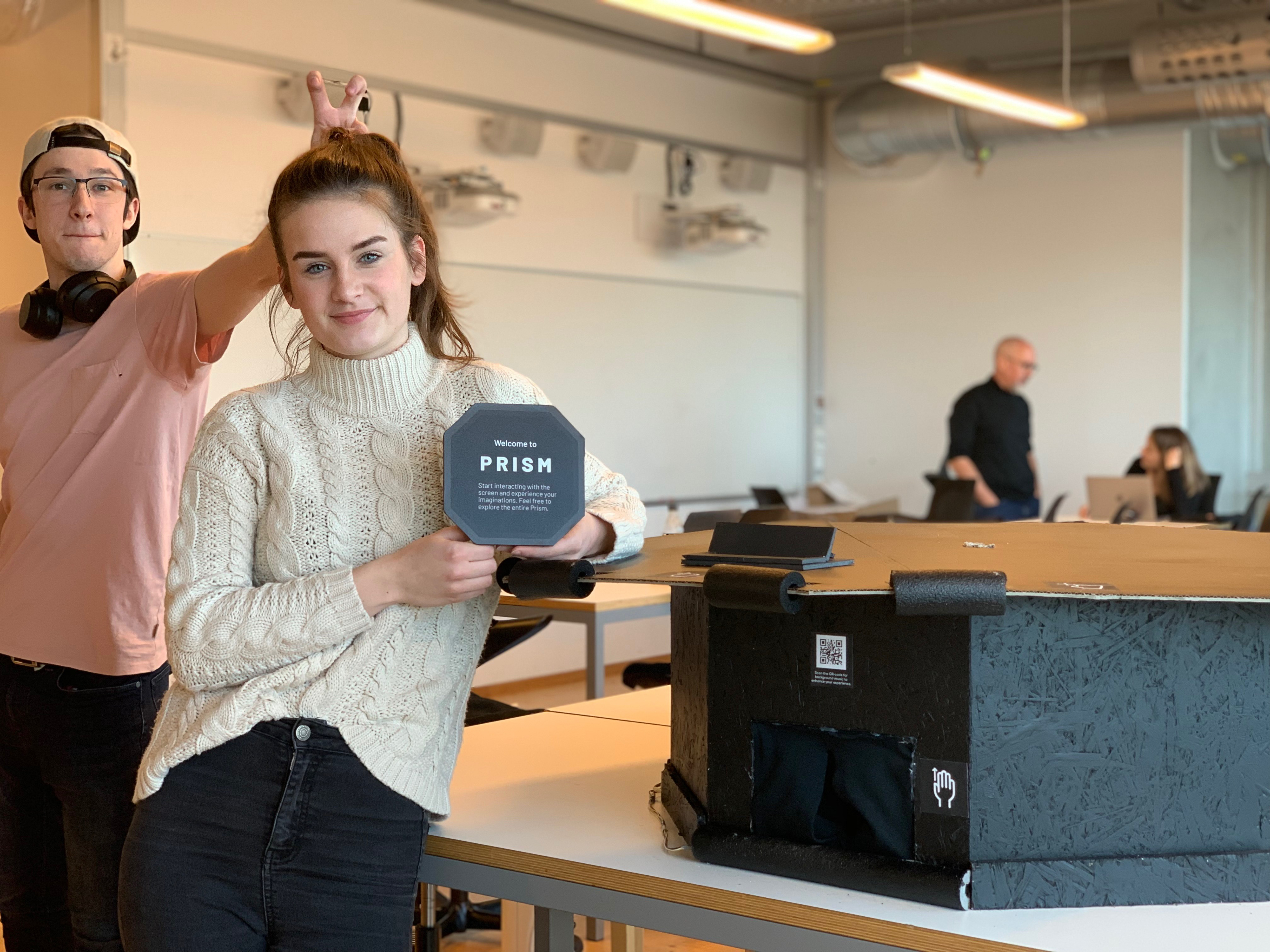
Usability Testing with classmates
Hi-fi 프로토타이핑 / Hi-fi Prototyping
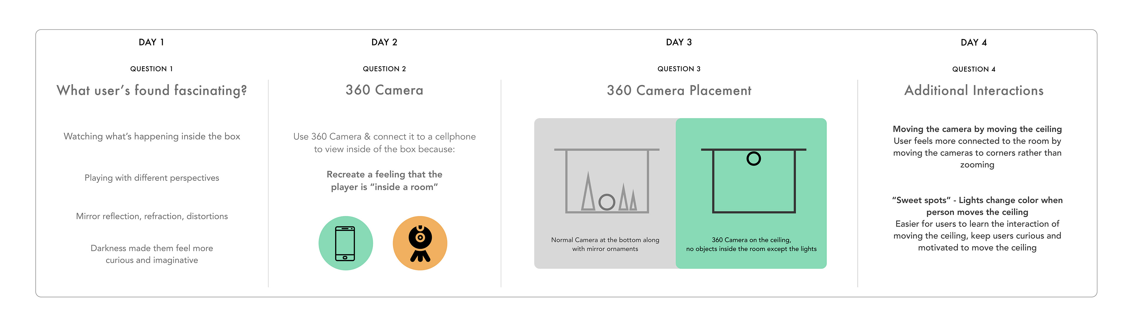
Through the iterative usability tests, we found that players found interpreting the infinite images and creating their own image interesting and playful. Keeping this as the player experience goal of our toy, we wanted players playing our toy to be able to:
• Change the colors of the lights
• View the space and the infinite images in different perspectives
• Have a surreal, immersive experience
토이의 유저플로우 리뷰 및 개선 / Evaluating User Flow of the Toy
While observing the players, I noticed that some players did not know how to start playing with the toy. They said they have never played with something like this before, so it was overwhelming for them. So I wanted to enhance the user flow of playing our toy.
1. 현 유저플로우 시각화하기
First, I visualized the user flow of our toy to point out specific areas of improvement for interaction, like below:
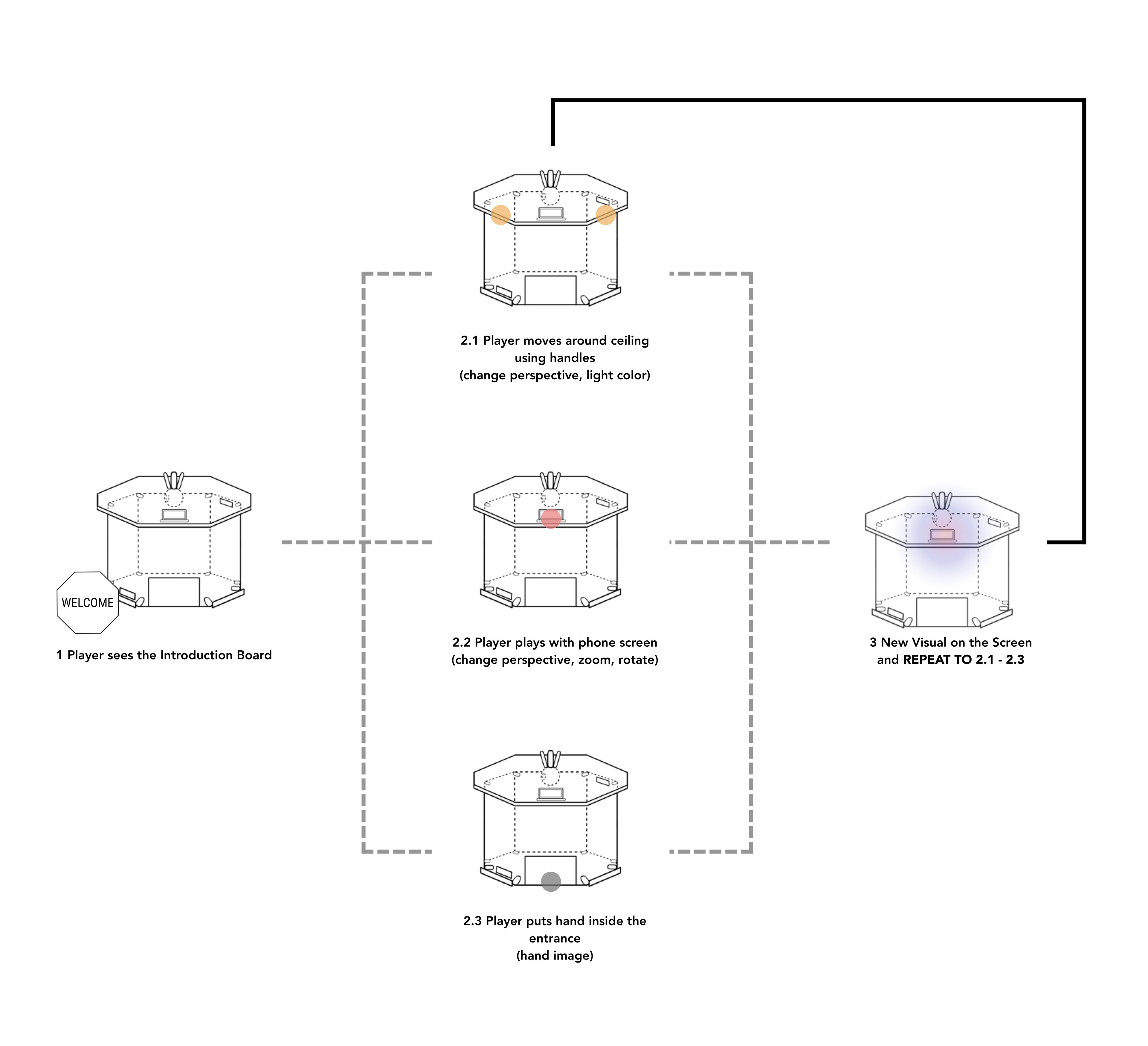
2. 인터랙션 개선하기 - 제스쳐 아이콘 & 오프닝 보드
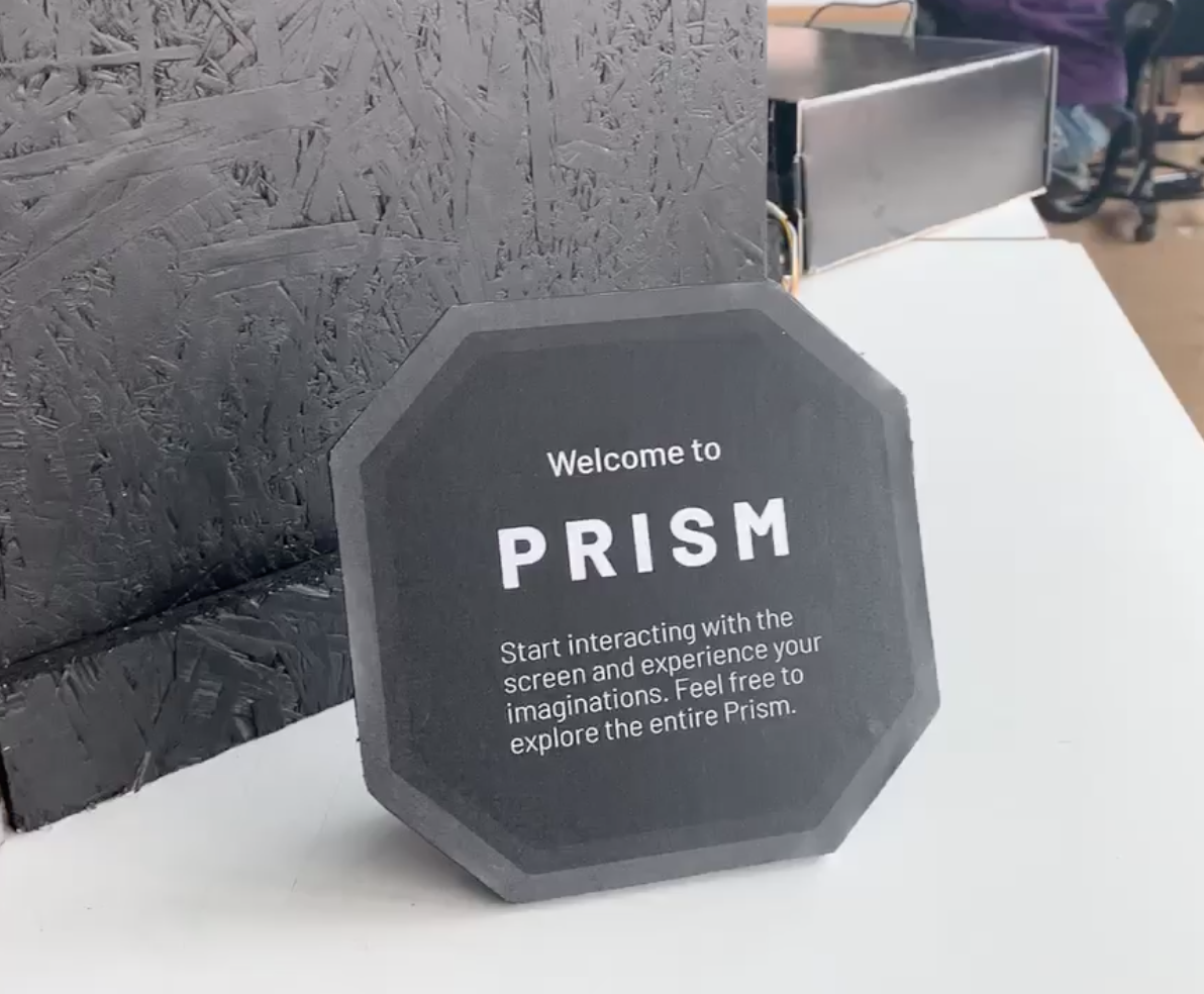
Doing so we added an instruction board that said to start interacting with the phone screen for the player - a visible element that would act as interaction touchpoint to guide the players on how to play with the toy. We also added gesture icons to help users understand what actions they can do at different parts of our toy, like a hand icon with arrows near the handles attached on the ceiling.

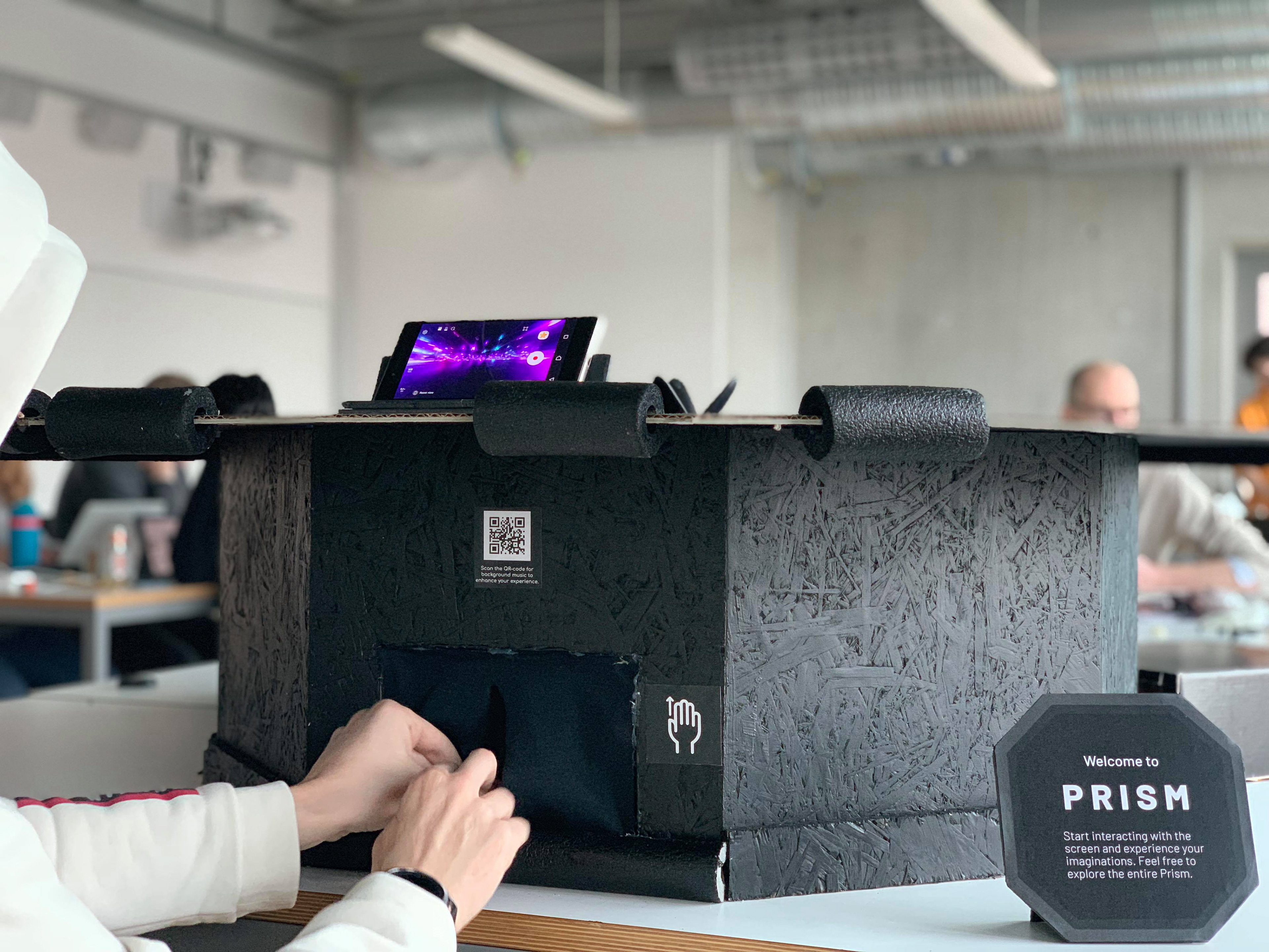
Gesture icons, Instruction board, Hi-fi prototype (from left to right)
브랜딩 /Branding
최종적으로, 사용자의 첫 인상과 토이의 기대감을 불어넣기 위해 브랜딩 디자인을 했습니다. 그 이름처럼 모던하고, 신비롭고, 어두운 방 안에서 빛나는 보석, 프리즘 같은 느낌이 나도록 컬러 조합과 폰트를 골랐습니다.
Finally, we branded the toy to set up a player’s first impression and expectation of our toy. Modern, mysterious, and reflection were values we wished to reflect through our toy: Prism.

느낀 점 / Reflection
직관적인 디자인을 하자
이 토이는 다양한 인터랙션 기능들을 가지고 있지만. 그렇기에 이 기능들을 직관적으로 깨달을 수 있는 행동 유동성 (토이의 모양, 소재, 디자인) 파츠들을 디자인하는데 신경을 많이 썼습니다.
Design an artifact that is easy to understand.
Our toy offered various ways of interacting with it but they sometimes went unnoticed. Thus we worked on improving the affordances of our toy (toy’s shape, material, and physical design) to make it intuitive.
테스트, 테스트, 또 테스트 만이 살 길
테스트, 테스트, 또 테스트 만이 살 길
초반에는 팀내에서 어떤 아이디어가 좋을지 상의를 많이했었습니다. 하지만 어떤 아이디어가 먹힐지는 도저히 예상할 수가 없었죠. 이 아이디어들을 프로토타입으로 실체화하고 테스트 하는 것이 결정하는데 제일 효율적인 프로세스라는 것을 깨닫기에는 오래 걸리지 않았습니다.
Build - then test, test & test.
In the beginning, we spent a lot of time discussing if our ideas were good ones. But along the process, we realized that building physical prototypes and testing our ideas out was the fastest way to know what ideas worked and why, and develop them to our toy.
'노' 는 새로운 '예스' 다
프로젝트 초반, 10중 9의 아이디어들은 빛을 보지 못했습니다. 매번 다시 0에서 시작하는 기분이었죠. 매우 무섭고 불안했습니다. 하지만, 새로 시작하는 시각을 가지자고 마음 먹었기에 더 자유롭고, 볼드하고, 새로운 아이디어들을 생각해 낼 수 있었습니다.
Saying Yes to (drastic) new changes. Our instructor's answer to a lot of our ideas was "no". So we had to start from ground zero for multiple times. which was scary. However, it let us be more free and bold with coming up with new ideas.
남는 건 좋은 팀워크
남는 건 좋은 팀워크
팀원들과 매일 하루를 시작하고 끝내는 6주간, 이 시간이 모두에게 즐거운 경험이었으면 좋겠다고 생각했습니다. 명확하고 편안하게 서로의 아이디어를 이야기하고 격려하는 분위기 조성이 있었기에 할 수 있었습니다.
It’s all boils down to teamwork.
I had to work with my teammates for 6 weeks, so I wanted to make it a great experience for all of us. Promoting good teamwork through clear, open communication and encouraging each other's ideas helped us stay motivated and push ourselves to design Prism within 6 weeks.
뒤돌아보면, 프리즘은 여태것 한 디자인 프로젝트 중 제일 힘들었지만 매우 값진 경험이었습니다. 전시회에서 프리즘은 관객들로부터 "탐험하는 것 같다", "매료된다, "흥미롭다" 등의 긍정적인 평가를 받았습니다.
Overall, I am very satisfied with how our project turned out; designing it was the most demanding but fulfilling project I have worked on so far. During documented play test sessions and final play test exhibition, Prism received positive reactions including its “explorative”, “fascinating”, and “curious”.