오히 - 오늘을 위한 생산성 앱
Hoy
201806 - 201808
UI/UX 디자이너 / UI/UX Designer
Sketch, InVision
대학교 2학년 여름방학 때, 대학생이었던 친구와 저는 한 고민에 빠졌습니다. 둘다 3학년으로 올라가면서 더 어려워지는 수업들과 수많은 과제들, 그리고 교외 활동까지 병행하려는 살인적인 스케줄에 앞이 깜깜 했습니다. 그 친구는 특히 오랫동안 생산성 앱을 사용하고 있었지만, 사용하고 나니 정작 중요한 장기적인 목표들을 이루는 건 여전히 힘들다고 말했습니다.
그래서 저는 그 친구를 위해 색다른 생산성 앱을 디자인 해보고 싶었습니다.
During my sophomore year summer break, I came across my friend’s problem which I emphasized a lot with as a fellow college student. He was worried about becoming a Junior and having to balance hard classes with work and social life. He has been using productivity apps to stay organized but he said they didn’t help him too much to accomplish his long term goals.
I wanted to help him contextualize the problem and come up with a viable solution - for making a new version of a productivity app.
리서치 / Research
이 앱은 두달 안에 디자인을 완성해야 했습니다. 첫 2주 동안은 앱 디자인을 위한 기본적인 리서치를 했습니다.
I had 2 months to design a full app. I spent about two weeks doing the base research to design this app.
사용자들 정하기 / Deciding User Group
제 친구(조지아공대 컴퓨터 공학 대학생)를 포함한 67.5%의 조지아공대 학생들이 생산성 앱을 사용하고 있었기에, 이 가상 앱의 사용자들은 조지아공대 학생들로 겨냥하기로 결정했습니다.
Although the primary user of the app was my friend (Computer Science major at Georgia Tech), I wanted to broaden our users to students at Georgia Tech as 67.5% of students uses productivity apps.
설문조사 / Survey
조지아공대 학생들의 생산성 앱을 썼을 때 경험과 목적을 달성하는 데 필요한 요소들을 알기 위해 제 친구와 몇명의 조지아 공대 학생들에게 아래 질의 문답을 포함한 구글 문서를 이용해 만든 설문조사를 행했습니다.
• 전에 써본 생산성 앱들과 평가
• 단기 대 장기 목표의 의미 (지속 기간에 의해서인가, 빈도에 의해서인가?)
• 어떻게 생산성 (목적을 이루기 위해 하는 노력 및 관리)을 키우는지 - 중요도 순위 매기기, 카테고리로 매기기, 리스트 만들기 등
I asked my teammate and couple more school friends about their experiences of using a productivity app or planner through a Google Form to collect qualitative data. Some questions I asked were:
• Past experience using productivity apps
• How user would define long-term and short-term goal (duration vs frequency)
• How users manage their tasks (prioritizing, categorizing, number of lists)
시장조사 / Market Research
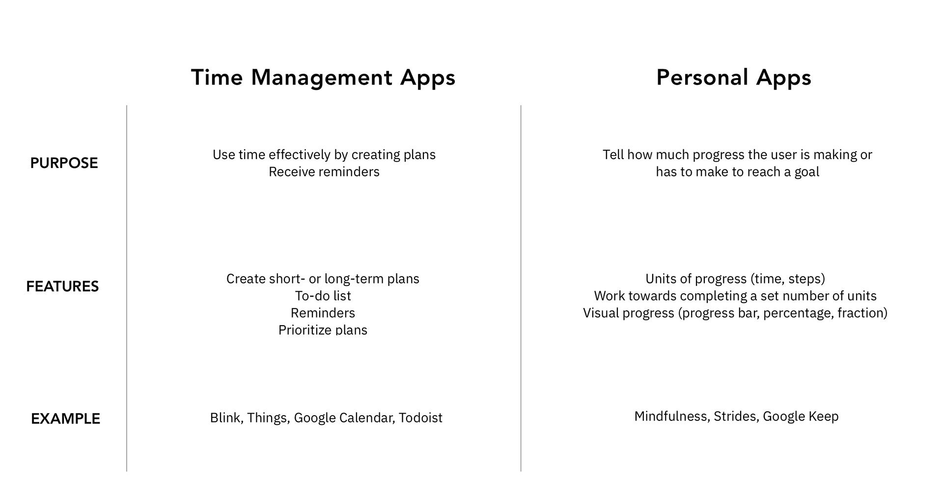
현재 사용되고 있는 생산성 앱과 효율성 앱을 비교하기 위해 시장조사를 했습니다. 각 앱의 목적과 기능을 비교함으로써 저는 제가 디자인 하려는 앱은 생산성과 효율성 앱의 융합이라는 것을 깨달았습니다.
I conducted a market research on existing productivity and time management apps. From this research I was able to determine that our app would be a combination of project management and productivity apps.
발견 / Insights
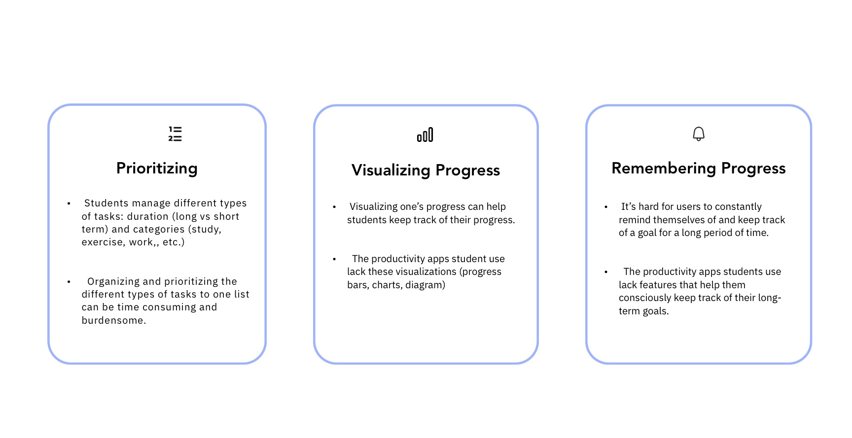
리서치 결과를 통해, 총 3가지의 개선점을 발견했습니다:
1. 우선순위 매기기 - Prioritizing
• 학생들은 다양한 종류의 목표들을 동시다발적으로 진행시키고 있다.
• 그렇기에 매번 그 종류들을 하나의 기준에 따른 우선순위로 매기기가 애매하고 번거롭다.
2. 과정 보여주기 - Visualizing Progress
• 학생들이 현재 사용하고 있는 생산성 앱은 목표들을 이루면, 그 성과나 과정이 기록되지 않는다.
• 과정과 성과를 시각적으로 보여주면 성과를 이어가기가 더 쉬워진다.
3. 과정 기록하기 - Remembering Progress
• 장기목표는 어디서 멈추었고, 어디서 다시 시작해야하는지 기억하기가 힘들다.
After conducting the research and analyzing the data, I was able to categorize my findings to 3 insight groups and design criteria:
아이디어 / Ideation
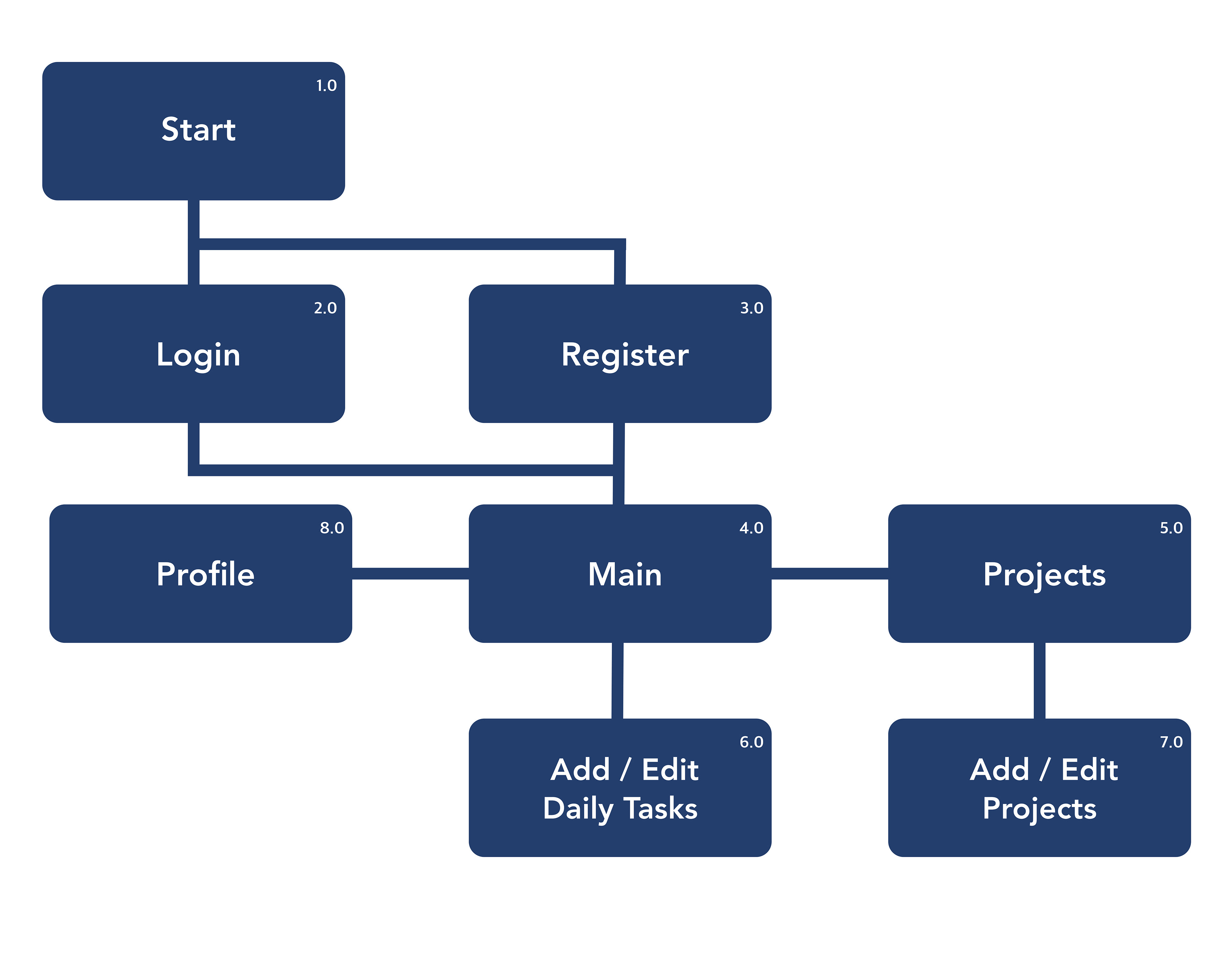
앱을 본격적으로 디자인하기에 앞서, 앱의 전체적인 플로우와 기능을 파악하고 배치하기 위해 사이트맵과 와이어프레임으로 제작했습니다. 앱의 기본적인 틀과 기능들은 기존의 생산성 앱과 크게 다르지 않습니다.
이 둘을 제작하면서 앞에 발견한 개선점들을 해결하고 기존 앱들과 차이점을 둘 방안들을 생각 해냈습니다.
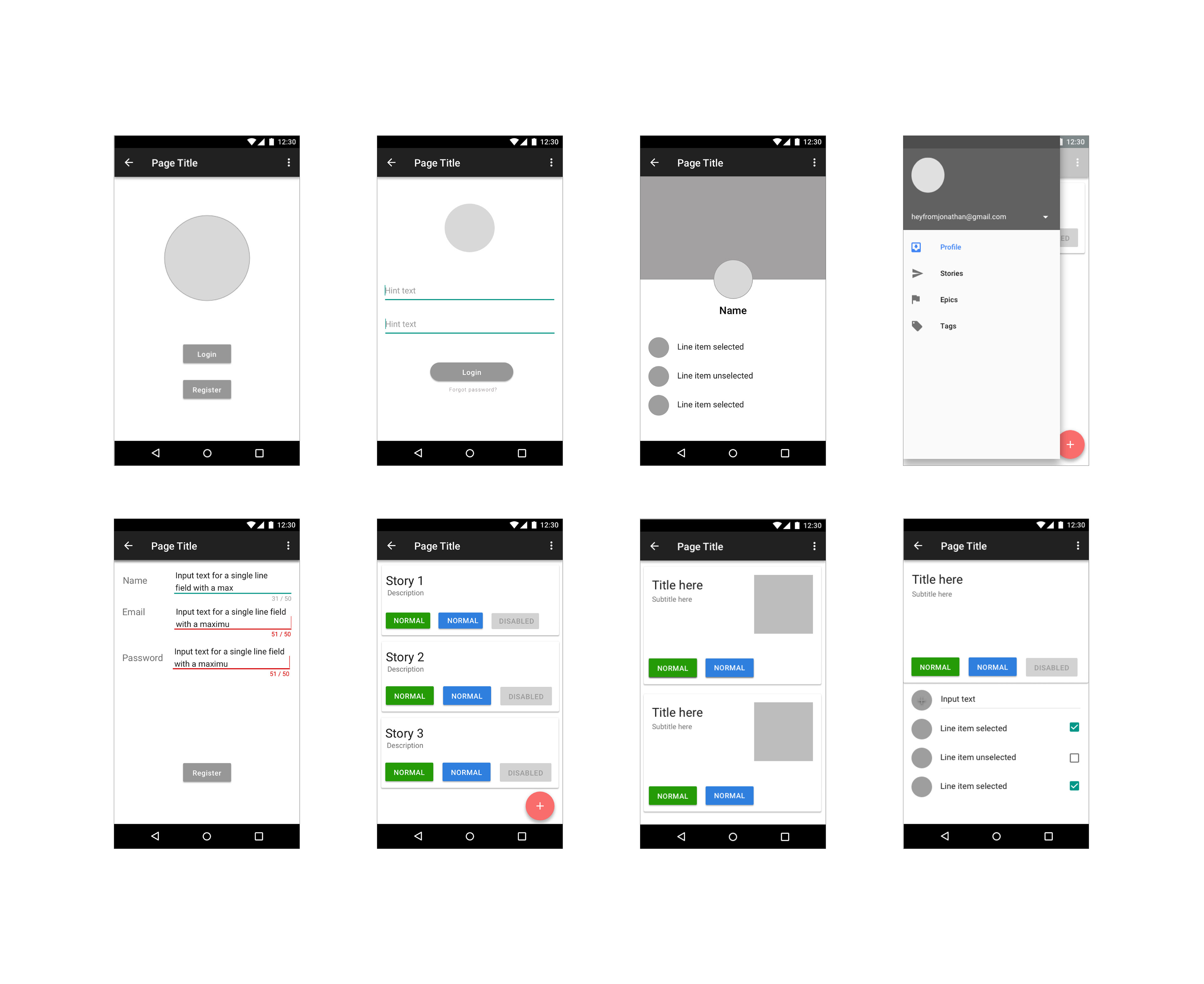
I started creating a sitemap and low-fi wireframes for primary use cases. There are two design choices I made while working on the wireframes based on the insights.
1: 앱의 사용성
와이어프레임을 만들면서 우선 학생들에게 추가하는 항목이 단기 목표인지 (Daily Task) 아니면 장기 목표인지 (Projects) 정할 수 있는 기능을 추가했습니다.
처음에는 단기 목표와 장기 목표를 각각의 페이지에 두려했으나, 메인 페이지를 달력처럼 그 날의 날짜로 설정하고 그 날짜에 해당하는 단기와 장기 목표들을 하나의 리스트에 넣는 것이 더 좋다고 판단했습니다. 그렇게 하면 같은 날의 단기와 장기 목표들을 확인하기 위해 다른 페이지로 이동할 필요가 없고, 그 날 해야 할 분량도 체감할 수 있기 때문입니다.
Design choice 1: Usability of the app
As I was working on the wireframe, I realized that it would be better to have milestones from Projects and reminders for Daily Task on a single list so the user can have a holistic view of their day and would not have to switch back and forth screens with only milestones from Projects and with only reminders for Daily Tasks.
Also, allowing the user to keep a detailed log for a milestone will further decrease the user’s burden of having to remember where they left off in the previous milestones.
2: 앱의 디자인 시스템
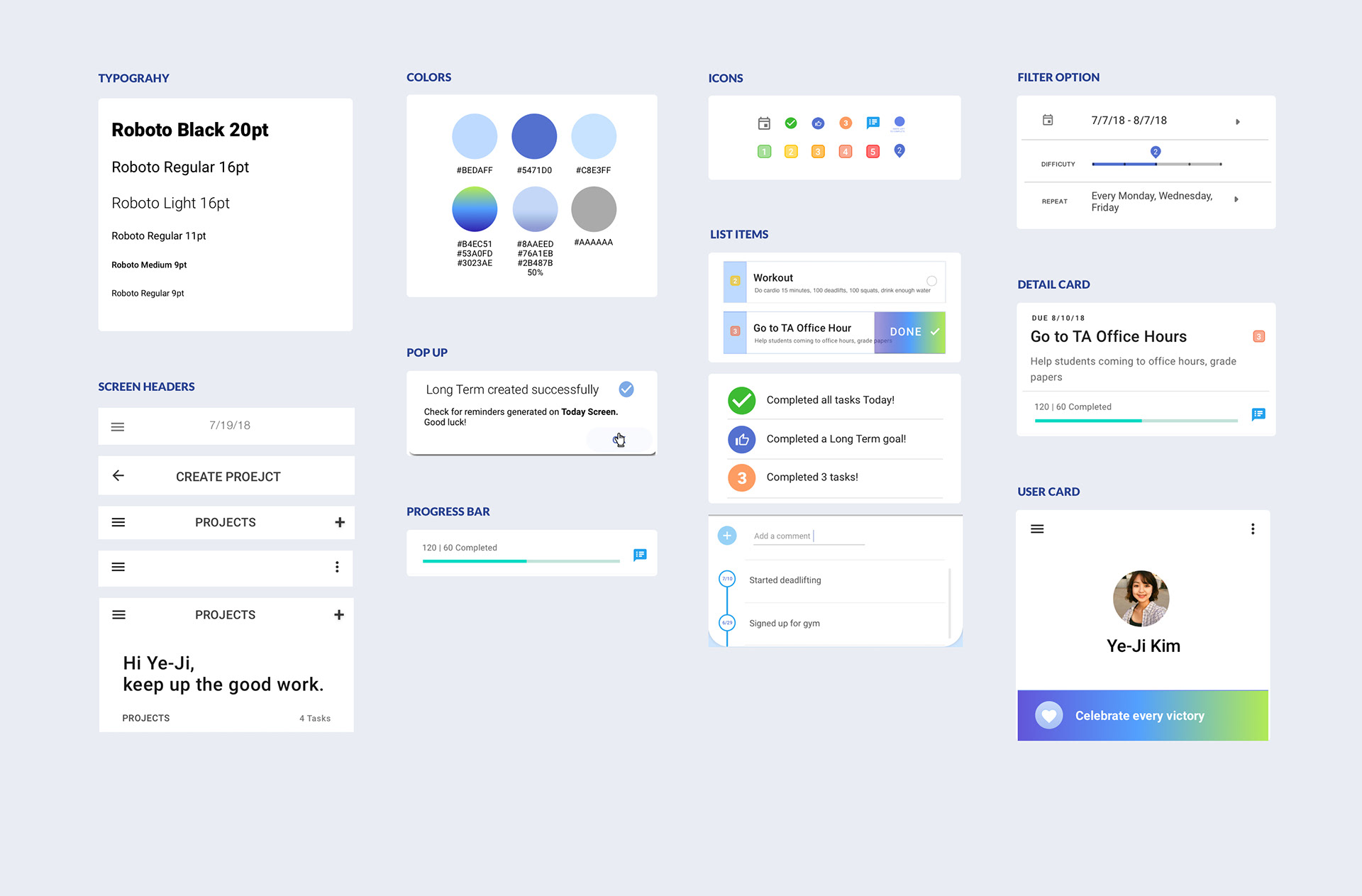
이 생산성 앱은 안드로이드용이기에 Material Design 가이드라인을 따랐습니다.
UI 요소들은 깔끔하고 정리된 느낌을 주고 싶어 흰색과 파란색 테마의 팔레트를 썼습니다. 특히 리스트로 만들어졌을 때 다양한 리스트 아이템들의 가독성을 위해 Roboto 타이포그래프를 선택했습니다. 대신, 폰트의 무게와 크기를 다르게 하여 구조를 이루게 했습니다. 전체적인 브랜딩을 위해 앱이 시작할 때 초기화면의 로고도 디자인 했습니다.
리서치 후 남은 한달 반 동안 순차적으로 3개의 디자인 테마를 구성하며 최종 디자인 테마를 디자인 했습니다.
Design choice 2: Design System
As I was designing an Android app, I followed the Material Design guideline. I customized the component so they will be consistent across the entire app and align with the mood I wanted to capture.
For the UI design of the app, I wanted to capture a clean, calm, organized feeling for the user experience of the app. I used white and light blue color scheme and Roboto typeface to ensure legibility and readability of the content. I also created the logo for the starting screen to complete the branding of the app.
Over the remaining month and a half, I iteratively came up with 3 design themes.

최종 디자인 / Final Solution

오히 는 심플한 안드로이드용 생산성 앱이며, 사용자로 하여금 단기와 장기적 목표를 이룰 수 있게끔 도와줍니다.
Hoy is a simple, habit-forming productivity app that encourages and helps users meet their long and short-term goals. Link to InVision Prototype.

느낀점 / Takeaways
피드백은 금이다!
처음하는 디자인 프로젝트였기에, 페이스북 메신저로 친구들에게 디자인을 보여줬을 때 말해주는 피드백들이 특히나 더 소중했습니다. 이 앱을 사용할지도 모르는 친구들에게 보여줬기에 제 디자인에서 효과적었던 부분은 강조하고, 애매했던 부분은 개선할 수 있었습니다.
Ask for feedback.
When I wanted to see if my design choices were effective, I reached out to my friends over Facebook messengers if they could give feedback on the current design. Their feedback was crucial as they helped me understand exactly which part of my design was or was not working.
통일한 단어들로 소통하기
통일한 단어들로 소통하기
프로젝트 초반에 디자이너로서 개발자인 친구와 소통할 때, 어떤 단어가 어떤 기능을 일컫는지 서로 헷갈렸던 경우가 종종 있었습니다. 후에 미팅으로 기능들을 함께 정리해서 해결은 됬지만, 통일한 단어들로 소통하는 것이 매우 중요하다는 것을 깨달을 수 있었던 값진 경험이었습니다.
Use consistent terms.
When communicating with each other as a developer and a designer, my friend and I were often confused because we kept switching terms to describe the concept of long- and short-term in the app. We had very different understanding of what these terms meant and even had to schedule multiple meetings just to clarify these terms. If we decided to use one set of consistent terms to describe the feature of the app in the beginning, we wouldn't have went through this confusion. It was a valuable lesson that I have learnt creating my first design challenge as a team.